The classic white subway tile had a great run. But tile design has moved into genuinely interesting territory — zellige, large-format porcelain, handcrafted ceramics, and material-matched slabs are redefining what backsplashes and floors can do for a room.
Tile is one of the oldest building materials in existence. It’s also one of the fastest-moving categories in home design right now — driven by a shift away from the uniform, machine-perfect aesthetic that dominated the 2010s toward surfaces that feel tactile, individual, and connected to craft. The white 3×6 subway tile with dark grout is strongly associated with the farmhouse era of the last decade and doesn’t reflect the warmer, more layered palettes homeowners are gravitating toward now.
What’s replaced it is more interesting: a spectrum of options, from the seamless drama of full-slab stone to the gloriously imperfect shimmer of hand-glazed zellige. Understanding the difference — and what actually holds up in real use — is what separates a kitchen or bathroom that feels fresh in five years from one that needs rethinking.
The five directions tile design is heading
1. Zellige: beautiful imperfection, deliberately chosen
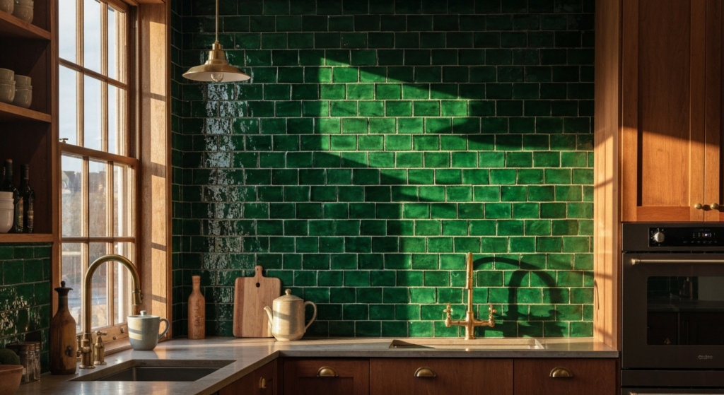
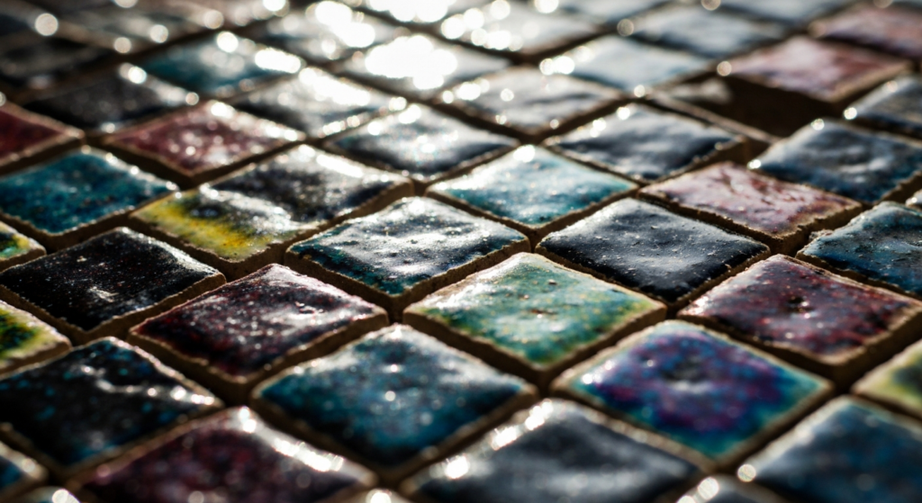
No single tile material has generated more conversation in the past two years than zellige. Handmade in Morocco using a process passed down for centuries, zellige tiles are clay tiles with natural variations in texture and color glazing that give a beautifully one-of-a-kind look. Their uneven surfaces and subtle color shifts mean no two installations ever look exactly the same — and that’s not a flaw. It’s the point.
The high-gloss glaze on zellige reflects light beautifully and dynamically, shifting in tone throughout the day as light angles change. In a kitchen, a full zellige backsplash — particularly in deep greens, soft sage, warm ivory, or rich navy — creates a level of visual richness that mass-produced tile simply cannot replicate.
A few important caveats: because zellige tiles are not uniform and sometimes have sharp or chipped edges, they’re ideal for walls and backsplashes but not recommended for floors. And because of their variation, they’re difficult to install — professional tile installation is essential, not optional. Budget accordingly: zellige costs more per square foot than standard tile, and the installation labor reflects the added complexity.
“If you have a limited renovation budget, the backsplash is where you’ll get the most ‘wow’ for your dollar. A wall of shimmering zellige tiles tells a story. It reflects light, adds artisanal texture, and communicates a specific mood.”
Going large
2. Large-format tile: fewer grout lines, bigger visual impact
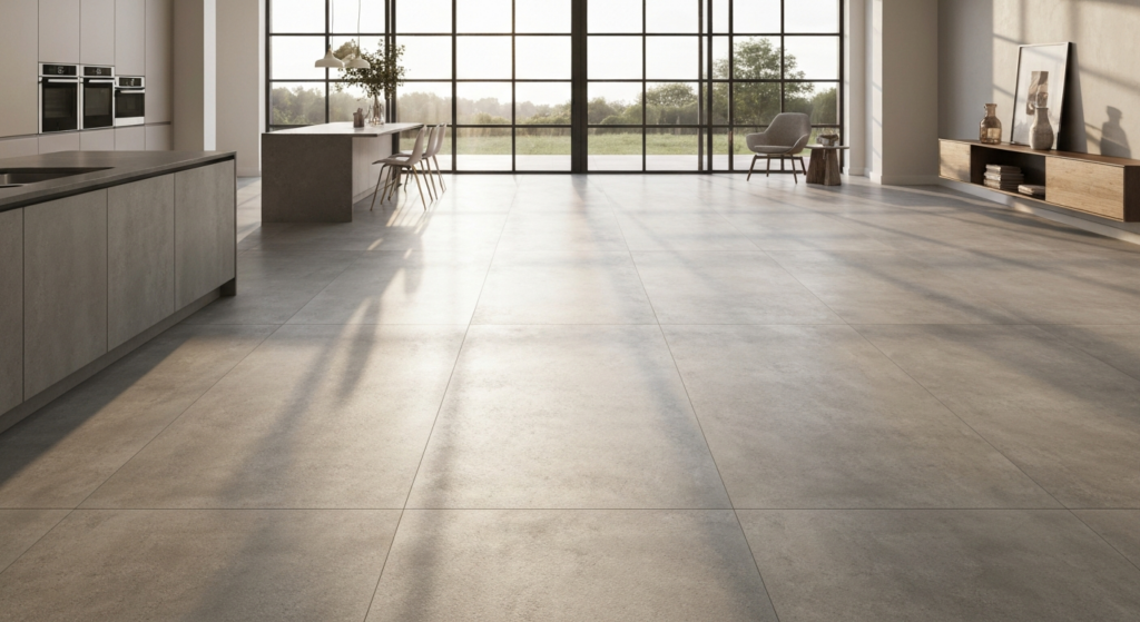
Large-format tile — generally anything 24 inches or larger on its longest dimension — has become the dominant choice for contemporary bathrooms and kitchens seeking a clean, architectural feel. The logic is straightforward: fewer grout lines means less visual interruption, easier maintenance, and a surface that reads as calmer and more spacious.
A 24×48 inch porcelain tile delivers eight square feet of uninterrupted surface. Run it floor to wall in a bathroom and you get the wrapped, cohesive look of a wet room without the full wet-room construction cost. The spatial effect on even a modest bathroom is remarkable — what feels like a small space with standard-format tile reads as open and intentional with large-format.
The most popular finishes in large format right now are matte and honed, rather than polished. Matte porcelain in earthy tones — warm beige, concrete gray, soft travertine — offers a quieter, more sophisticated look than the high-shine slabs of the 2010s. The practical benefits hold too: matte finishes hide smudges, water marks, and minor imperfections far better than polished surfaces.
The material-matched approach
3. Slab backsplashes: when the countertop becomes the wall
The single most requested high-end kitchen look right now isn’t tile at all — it’s the extension of the countertop material directly up the wall. Running quartz, quartzite, or sintered stone vertically from counter to upper cabinets (or ceiling) creates a seamless, grout-free surface where the stone’s veining flows continuously from horizontal to vertical. It’s an architectural statement in a single material.
The practical appeal matches the aesthetic one: no grout means no grout maintenance. The surface is impervious and effortless to wipe clean. For homeowners with young families or anyone who cooks seriously, the low-maintenance argument alone is compelling — independent of how the finished result looks.
For those who want the slab aesthetic at a more accessible price point, large-format porcelain tiles that mimic stone convincingly are a well-established alternative. Minimizing grout lines and choosing a tone-on-tone grout — where the grout color closely matches the tile — preserves most of the visual effect at a fraction of the material cost.
Pattern and personality
4. Patterns — but not the ones from five years ago
Pattern is back, but it’s shifted. The geometric tile trends of the mid-2010s — penny rounds, black-and-white hexagons, bold graphic prints — have given way to something more refined and more enduring.
Herringbone and chevron layouts remain strong precisely because they add visual dynamism using a classic tile format — no new color, just a rearranged direction. Longer, thinner subway tiles (2×8 or 3×12 rather than the original 3×6) in a vertical stack or herringbone feel significantly more contemporary than their shorter predecessors. The updated checkerboard — reimagined in shades of sage green, dusty blue, or warm terracotta rather than stark black and white — is having a genuine moment, particularly in powder rooms and compact bathrooms where a bold floor can anchor the whole room.
Hand-painted ceramic tiles are also making a return, most effectively used as a focused accent — behind the range, inside open shelving, or as a narrow border — rather than a full-coverage approach. At small scale, they add craft and character without overwhelming. Combined with plain, matte field tiles for the majority of the surface, a hand-painted inset tells a story while keeping the overall palette balanced.
- Herringbone – Classic pattern, contemporary in longer tile formats (3×12)
- Updated checkerboard – Sage, blue, or terracotta — not black and white
- Hand-painted accent – Used focused — behind range, inside niches — not full coverage
Color & finish
5. Earth tones and matte finishes: the palette shift that’s here to stay
The color story in tile right now is emphatically warm and natural. The cool gray and crisp white palettes that defined the previous decade are giving way to terracotta, warm beige, clay, soft sage green, deep forest, and dusty rose. These tones feel connected to natural materials — stone, earth, dried plant matter — and they photograph beautifully without feeling fashion-forward in a way that dates quickly.
Saves for “kitchen backsplash ideas” on Pinterest are up 35% in 2025, a clear signal that homeowners are actively researching this category — and the most pinned images consistently show warm, earthy palettes over cool neutrals.
Finish matters as much as color. The matte finish is the epitome of quiet luxury — it diffuses light for a soft, velvety look that feels modern and sophisticated. Matte also ages more gracefully than polished or glossy, which show every fingerprint and water spot. For floors specifically, matte finishes offer better slip resistance — a practical benefit that reinforces the aesthetic one.
- Warm beige – Pairs with oak, brass, white
- Terracotta – Mediterranean, craft-forward, timeless
- Sage green – Calm, nature-connected, versatile
- Forest green – Rich, dramatic, strong in zellige
How to choose — and what to avoid
With so many directions to go, the most useful framing is to start with permanence and maintenance, then work outward to aesthetics. Tile is not something most homeowners want to replace every five years. The choices that hold up best — zellige in jewel tones, large-format matte porcelain, stone-matched slabs — all favor materials that age well and improve with the light rather than requiring constant upkeep.
Worth considering:
- Tone-on-tone grout that matches or closely echoes tile color
- Large format for floors and shower walls — fewer grout lines to clean
- Zellige or handmade tile limited to walls and backsplashes, not floors
- Matte or honed finishes for high-traffic surfaces
- Pattern concentrated in one area — not every wall
- Extending backsplash to upper cabinets or hood for continuity
Common missteps:
- Dark grout on light tile — emphasizes every grout line visually
- Zellige on floors — not recommended, installation is problematic
- Polished tile on shower floors — slip risk and maintenance-heavy
- Mixing too many tile types in one space without a unifying element
- Classic 3×6 subway with contrasting dark grout — strongly dated
- Skipping professional installation for textured or handmade tile
The tile categories we stock are selected with these principles in mind: materials that perform in the conditions they’re sold for, in finishes that remain relevant beyond a single season. Whether you’re selecting a backsplash tile for your kitchen renovation, floor tile for a bathroom remodel, or a feature wall for a shower, the questions worth asking are always the same — how does this look in changing light, how does it clean, and will I still love it in ten years?
If the honest answer to all three is yes, you’ve found your tile.